Busmate
Roles: UX Research, UX Design, UI Design
Tools: Figma, Usability Hub
Timeframe: 2 months
View Clickable Prototype
Roles: UX Research, UX Design, UI Design
Tools: Figma, Usability Hub
Timeframe: 2 months
View Clickable PrototypeThe current bus schedule is listed on the city's website and posted at each bus stop, but this information quickly becomes inaccurate when traffic, maintenance issues, and assisting handicap passengers are taken into account. Additionally, ever since the city added new bus routes, there has been an increase in congestion, confusion, and frustration for commuters, especially at certain stops where up to seven bus routes converge.
The Busmate mobile app is a live bus tracking app that allows commuters to easily identify what bus is coming and when it is arriving in the Mid-sized Metropolitan City. The Busmate app prioritizes clearly displaying key information that a rider needs in order to experience a seamless and efficient trip.
Bus users and commuters residing in the Mid-sized Midwestern City.
To serve thousands of commuters, the client wanted to create a live tracking mobile app that would address these challenges. Specifically, the goals of this project were to:
I laid the foundations for my design by first conducting user research in the format of quantitative and qualitative research. I sourced participants from multiple online platforms and forums as well as my personal network.
I designed an online Google form in order to deploy a survey to a large number of people and achieve statistical significance with my data. This allowed me to understand user behaviors and thoughts at scale.
After the survey, I wanted an in-depth understanding of a bus rider’s emotions, desires, and expectations throughout their experience. The 1-1 interviews allowed me to ask specific follow up questions designed understand their behavior and experience of transit or navigation apps, what they liked about them, what they disliked, and how they used them.
I realized in my quantitative research, that I made my questions a bit too wide in scope and focused too much on the user’s overall bus commuting experience rather than their experience using apps. I adjusted my questions for my 1-1 interviews to focus more specifically on a user’s behaviors, thoughts, and feelings about the apps they use on their commutes.
Use the bus 'everyday' or 'often'
Have a 'very consistent' weekly schedule, Monday through Friday
Have a 'somewhat regular' weekly schedule, Monday through Friday
Take the bus to commute to work, school or training
Are not intimidated by taking a new bus routes
Regularly use a mobile app to help plan their bus-related travels
My qualitative research revealed deeper and more specific insights on a bus rider’s commuting experience and their likes, dislikes, & wishes about transit apps.
"I wish I had ETAs based on real-time traffic information."
- Participant 1
"The first thing I'd want to see when opening a bus travel app is 'Hello, [my name], and my usual bus route(s)."
- Participant 2
"I wish I could have up-to-date alerts that I could customize."
- Participant 3
Knowing when the bus will be arriving is the most important thing
Both early and late buses, but especially early buses, ruin a travel experience
Users would like to know when the next bus is arriving
Users want an app that knows their usual bus routes and will show them information related to it right away
I kicked off this project by researching three main competitors to understand their product’s strengths and weaknesses, as well as gain an understanding of basic user expectations when using transit apps. I looked at Citymapper, Google Maps, and Transit Stop.
Transit is focused on bus and train transit, providing arrivals times and estimates. Its weakness is that the UX is not intuitive, making it difficult to learn, and ultimately creating a more frustrating experience for the user.
Google Maps provides navigation information for drivers as well as transit users. It is intuitive to use, but its weakness that it is more robust than what a bus commuter needs, burying necessary information further into the app.
Citymapper is an extremely robust transit app that covers anything from a bicycle to a ferry. It has an intuitive interface, especially for the amount of features it has. Its weakness is that it is overloaded for someone who is looking for one type of commute.

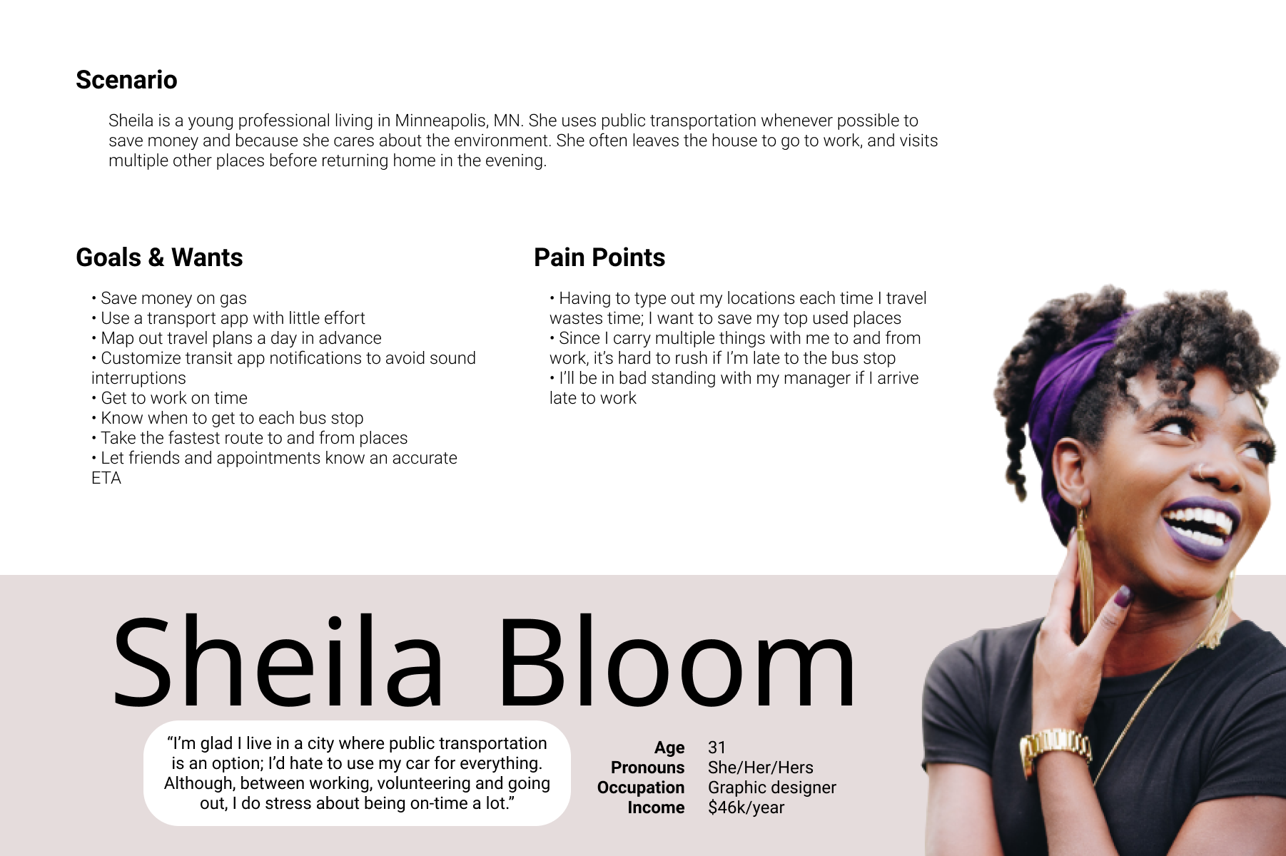
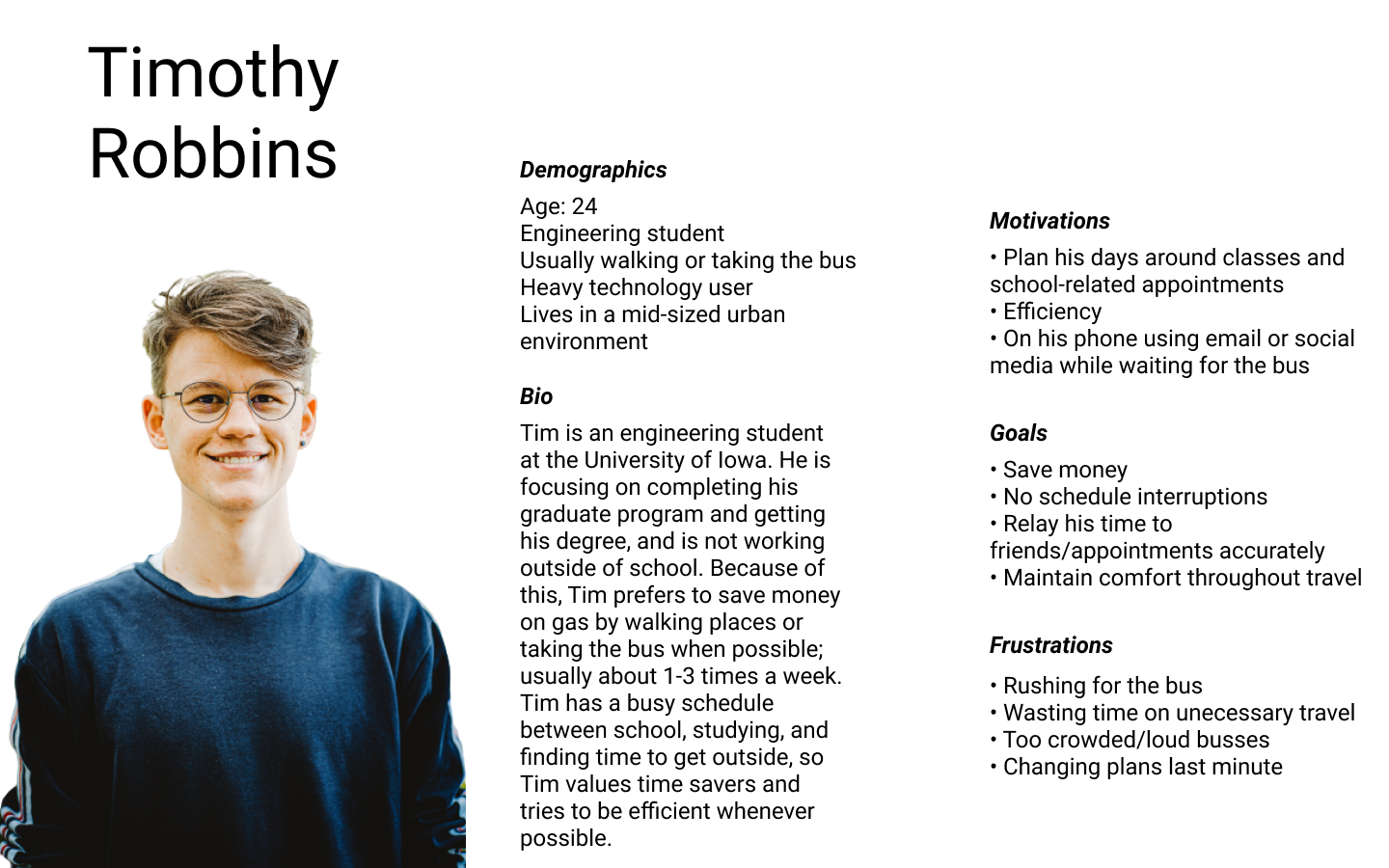
Based on the data collected in my research, I created a user persona that captured consistent behaviors, goals, and needs amongst the research participants.
The Busmate mobile app is a live bus tracking app that allows commuters to easily identify what bus is coming and when it is arriving in the Mid-sized Metropolitan City. The Busmate app prioritizes clearly displaying key information that a rider needs in order to experience a seamless and efficient trip.
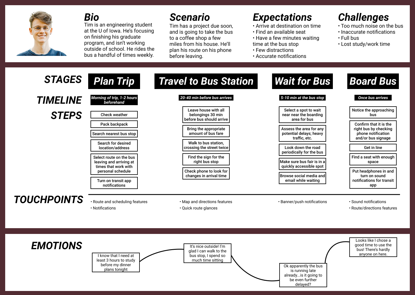
I then created a customer journey map for Eric to really get into his mind and empathize with his experience of taking the bus everyday to and from work. This was a great exercise because as I imagined the emotions Eric would encounter along the way, it allowed me to realize new design opportunities for later iterations of the app’s design (but not for the MVP) such as having a weather widget or playing music from the app.
Key opportunities:
To prioritize the features of the bus transit app, I created user stories based on tasks and potential motivators. After creating as many as I could think of, I then prioritized the list to would meet Eric’s greatest needs in a minimum viable product.
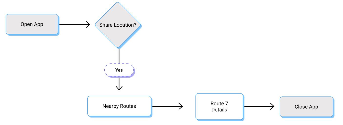
I created user flows to visualize the path a user would take through my interface to complete the high-priority tasks identified in my user stories. This helped me understand the kind of visual hierarchy I would need to design and how all the elements would relate together.
User story: As a user, I want to see how far my bus is, so I know how much time I have to make it
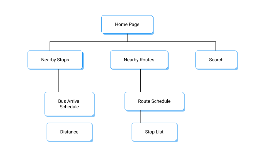
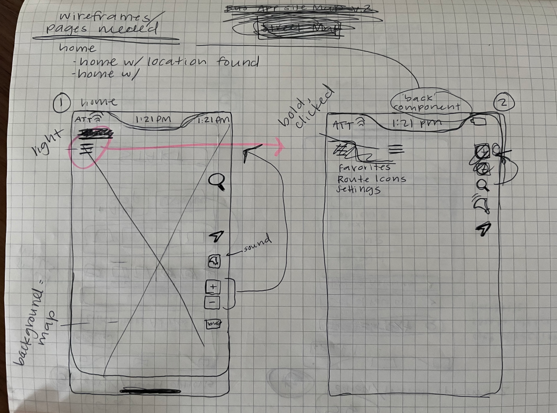
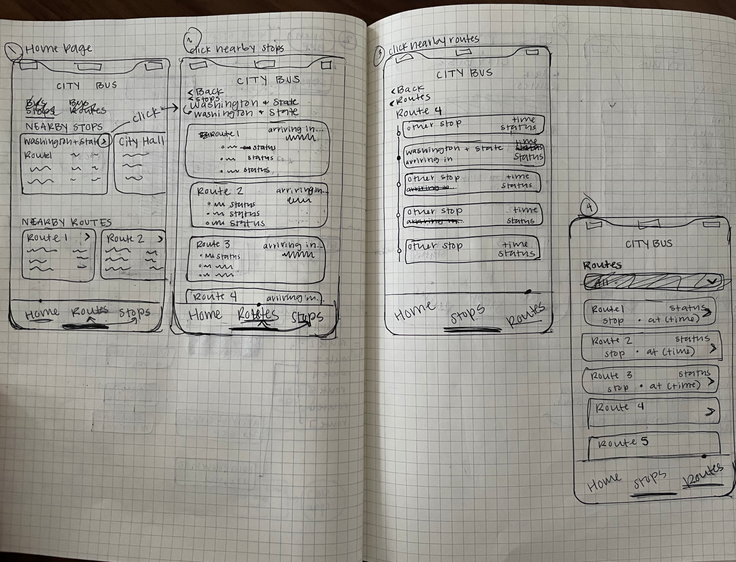
After understanding the screens I would design from the user flows, I created a site map to organize my screens and lay out the hierarchical structure of my app.
I narrowed down the site map as I gained a better grasp of the client’s expectations and the scope of work.
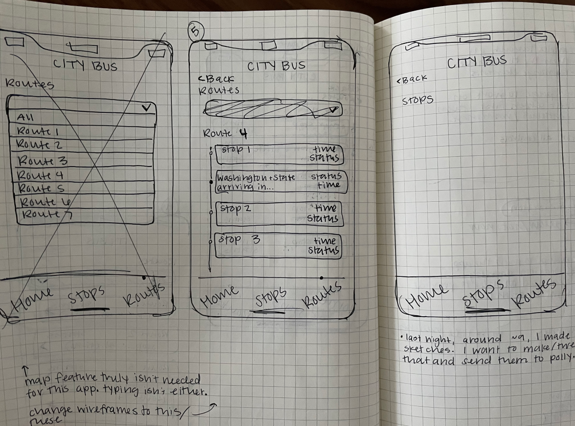
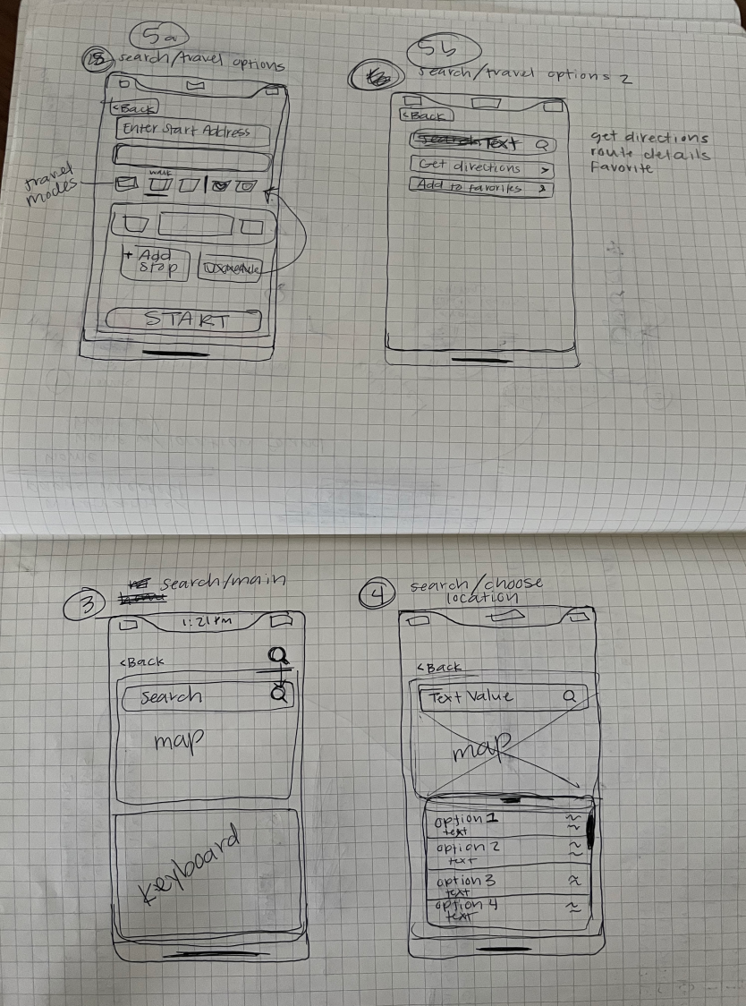
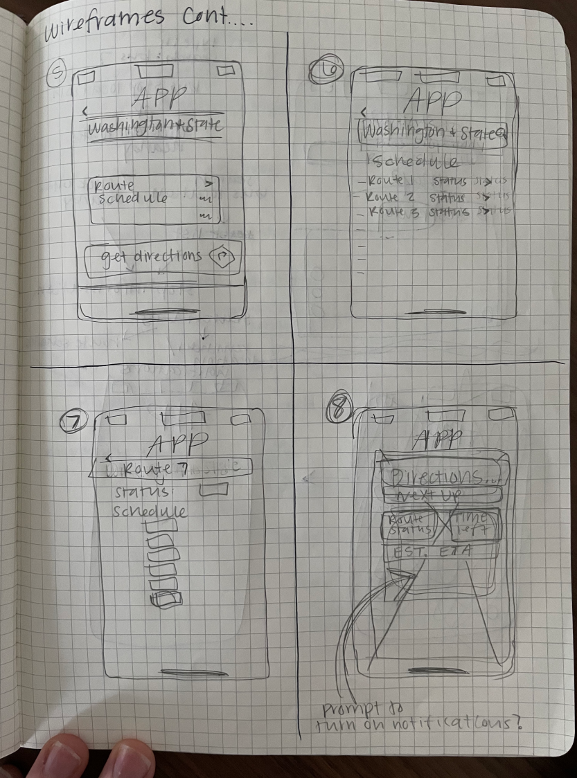
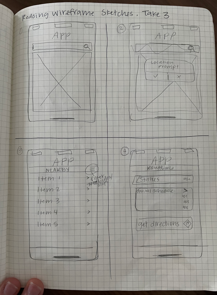
After creating user stories, user flows, and a site map, I started sketching out low fidelity wireframes. I used the Four Ups method to jump start my brainstorming process and churn out quick iterations.
I found this really valuable because it helped stretch my creative problem solving capacity to find viable solutions and lead me towards a more refined working solution for the app.
I then created digital wireframes in Figma to begin early stage user testing. Testing was completed in-person on my iPhone using the Figma Mirror app. I walked each tester through a scenario and gave them two tasks to complete.

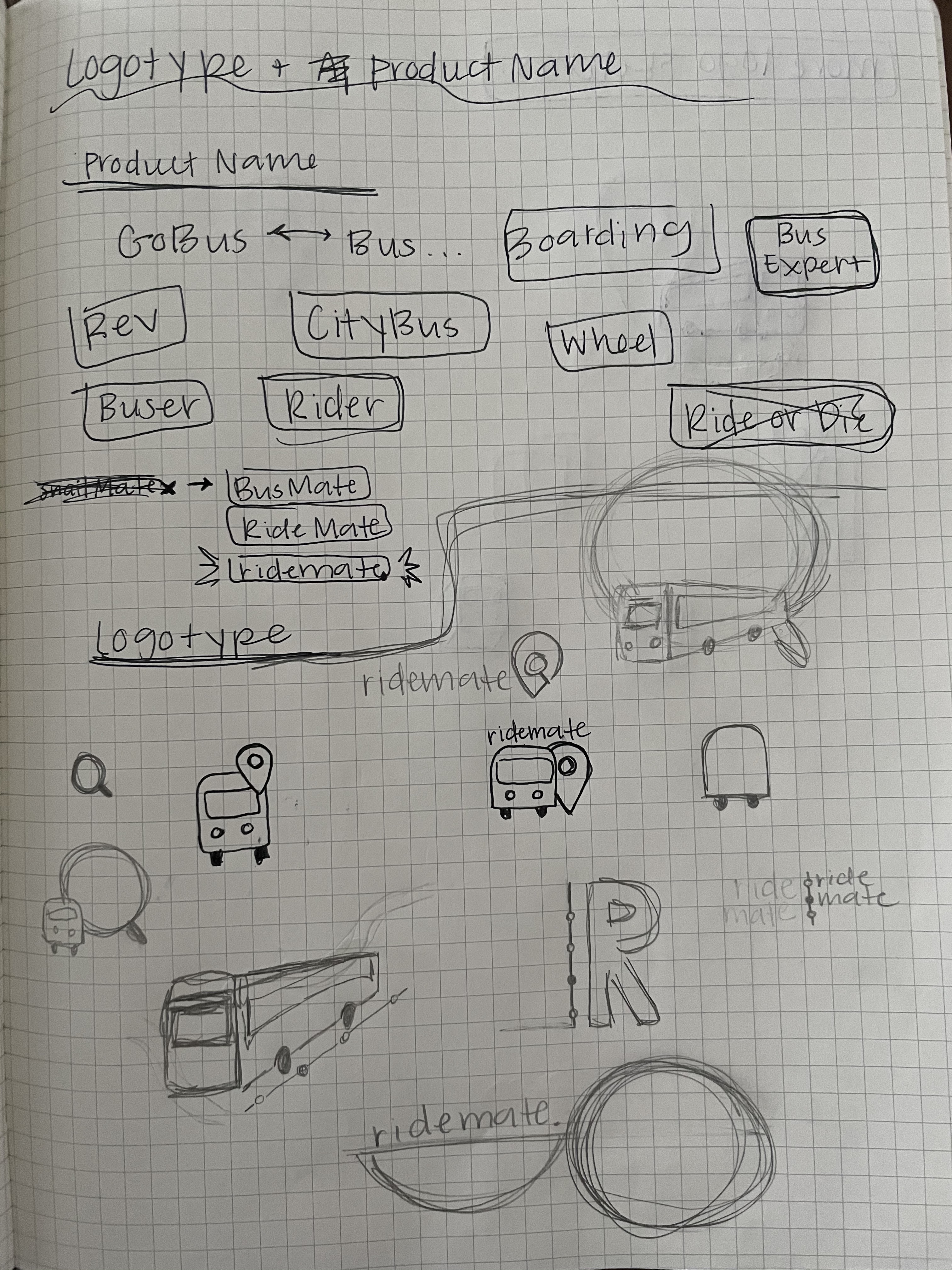
To create the brand in a fairly simple and efficient way, I did the following exercises:
I designed the logo by deconstructing the word “bus” and recombining the glyphs to resemble a bus route.
The dot encompassing the design is reminiscent of a location marker on a transit line. It also keeps the logo simple and distinct. For the smaller logo, I reduced it to the capital B in order to prevent it from looking cluttered and indistinguishable at a reduced scale.
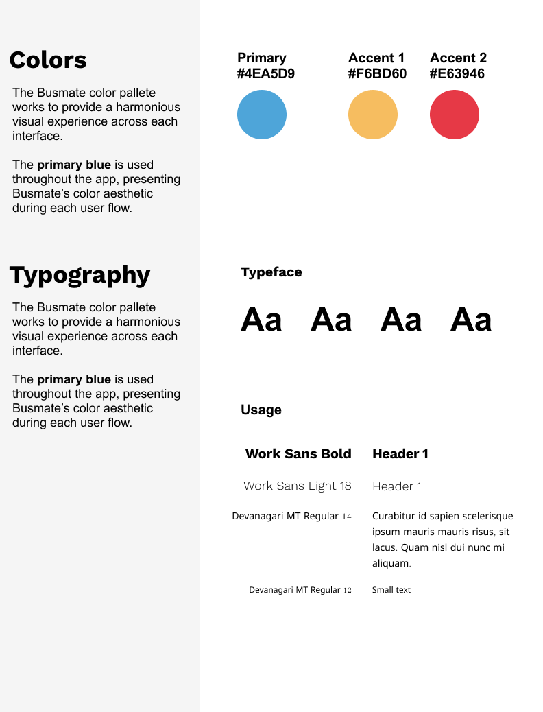
I selected typography that would fulfill two user needs:
1. It needed to look friendly and modern, as well as trustworthy
2. It needed to feel professional and instill confidence
I applied the same criteria to selecting colors. I wanted something bold and unique, but still tasteful and mature. I also looked at my competitors’ apps to find a color that would be distinct from theirs.
I applied the branding to the wireframes to create a high fidelity mockup. After skinning the wireframe, I set up another round of usability testing with three testers.
In response to the previous usability testing round, I added in an ETA section and a Minutes Away countdown. However, this proved to be unnecessary and confusing for users.
With all the feedback I received in my usability tests, I adjusted the design and the final mockup to:
It was also very valuable to receive positive feedback because it helped point me in the right direction and stay on track to eliminate the confusing parts, while retaining the successful parts.
1. A live map is not a priority
Users did not prioritize seeing their bus on a live map since they had reliable and accurate information about their arriving bus immediately presented to them.
2. Brainstorm, quickly and often
I learned the importance of brainstorming, quick iteration, and frequent testing at each stage along the way. Even from the very beginning, it’s extremely important to get a rough wireframe in front of another person who can give you feedback. The solution can only be solved in an iterative manner because you understand the users and the product more as you dive further into it.
3. Document everything
I also learned the importance of diligent documentation along the way as it provide highly useful and allowed me to pull together the information I needed in writing my case study and also putting this presentation together!